Intern Research – Sensory Design

Written By: Lauren Mullins, Architectural Intern

June 20, 2022

During my internship at Design Collaborative, I decided to research sensory design. My research focused on the various aspects and sensory types of sensory design to see how that can further be applied to sensory rooms. Sensory design can be described as design that engages the senses. The concept of this is to design past the visual aspects and involve the other senses as well. The main senses that I focused on in my research were auditory, tactile, and visual.

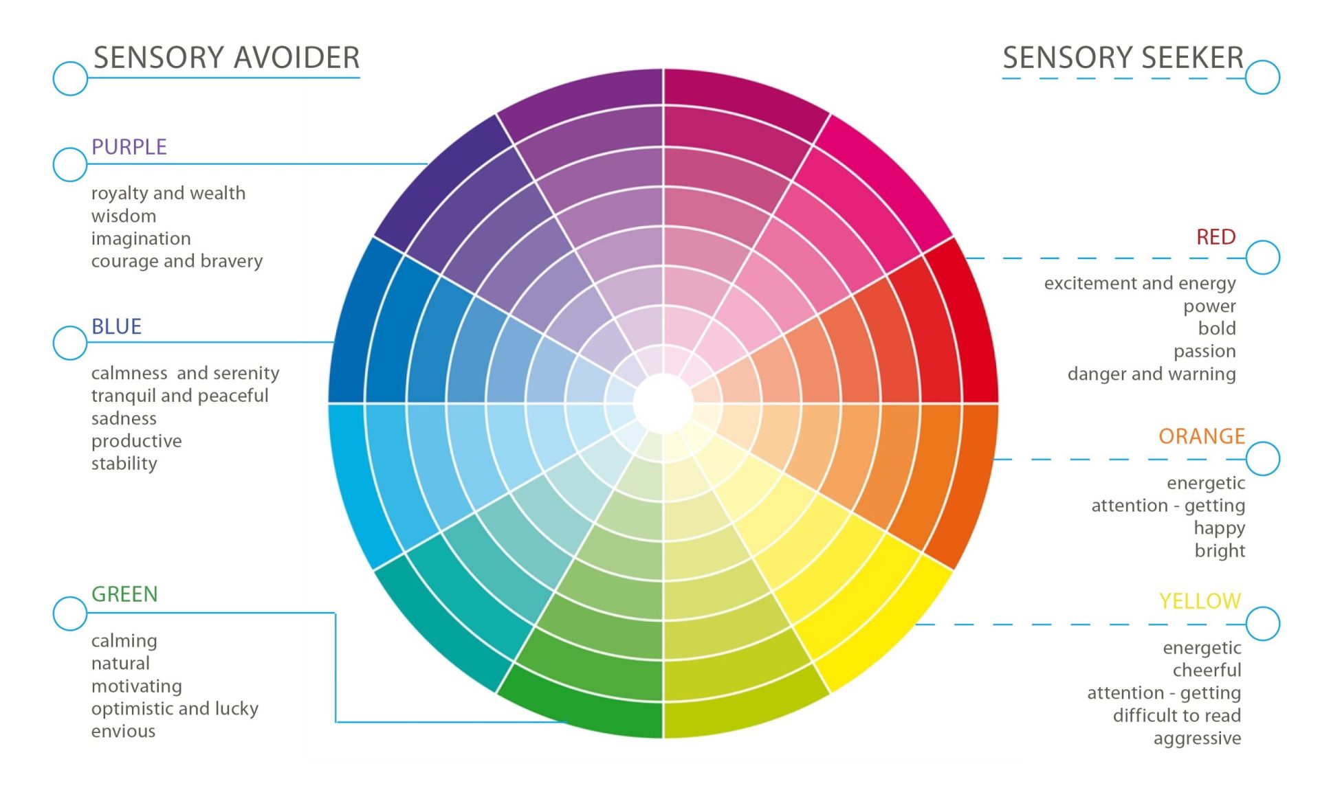
One thing that is important to understand in sensory design is that people experience and react to space differently. When it comes to how people experience sensory design, there are 2 different sensory types and those are sensory seekers and sensory avoiders. Sensory seekers are “hyposensitive” and need stimulation overload to feel calmer and more organized. Meanwhile, sensory avoiders are “hypersensitive” meaning they are overwhelmed by stimulation and prefer a quieter environment.

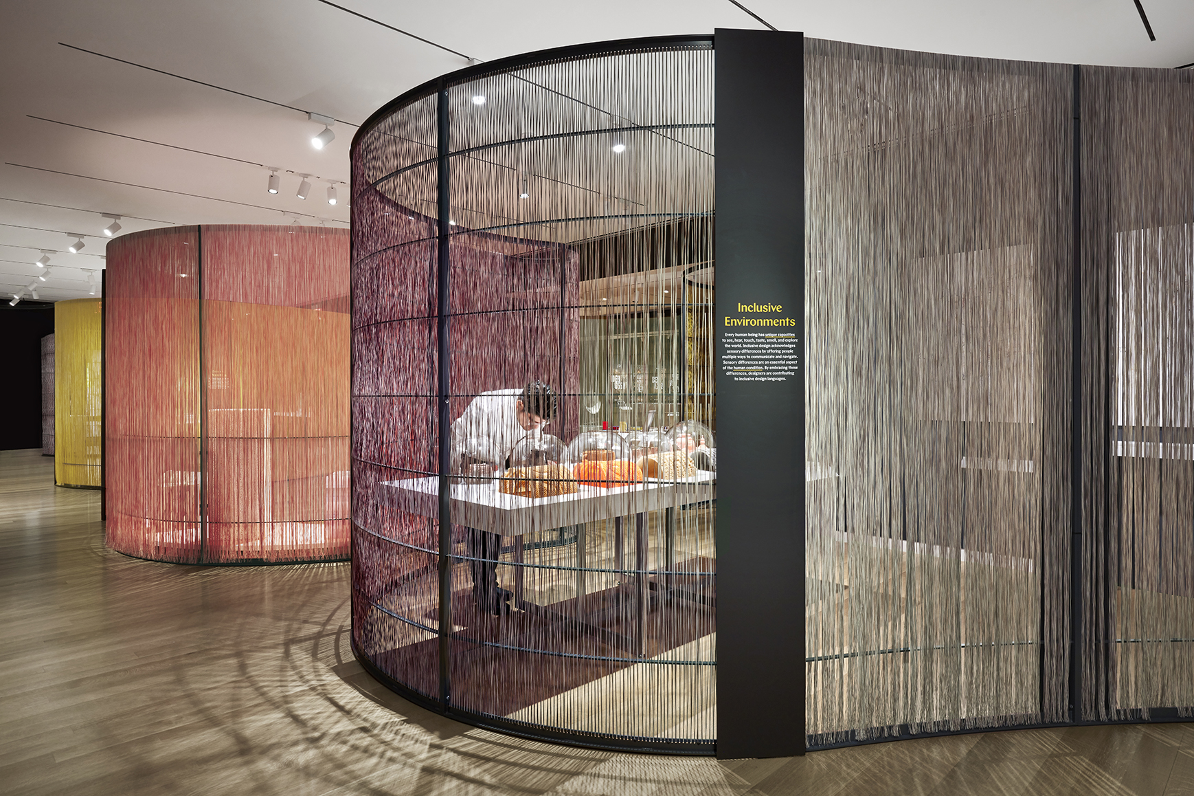
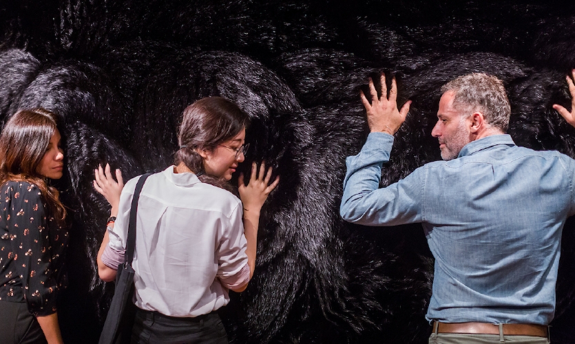
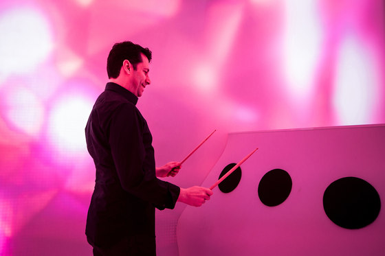
“The Senses”: Design Beyond Vision Exhibit – sensory seeker tactile experience.


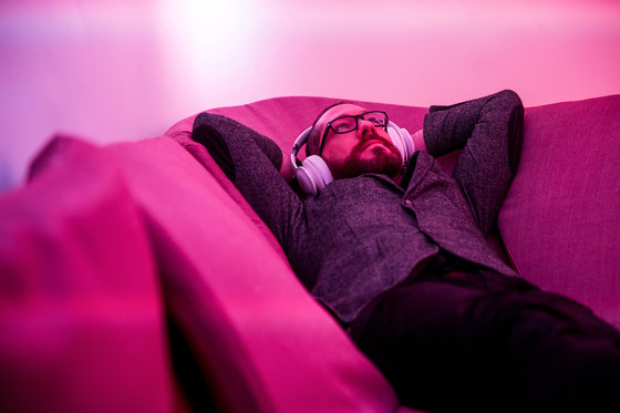
“The Senses”: Design Beyond Vision Exhibit – sensory avoider tactile experience

Images from The Senses—Design Beyond Vision Both a Feat and a Feast | SEGD

Intern Research Sensory Design Intern Research Sensory Design

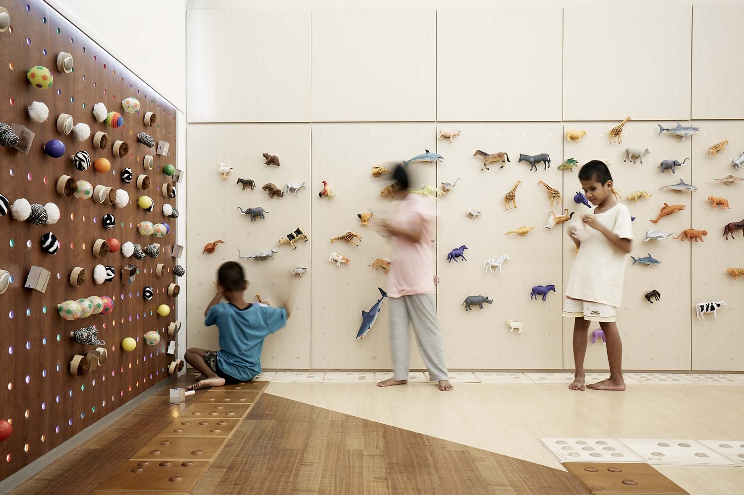
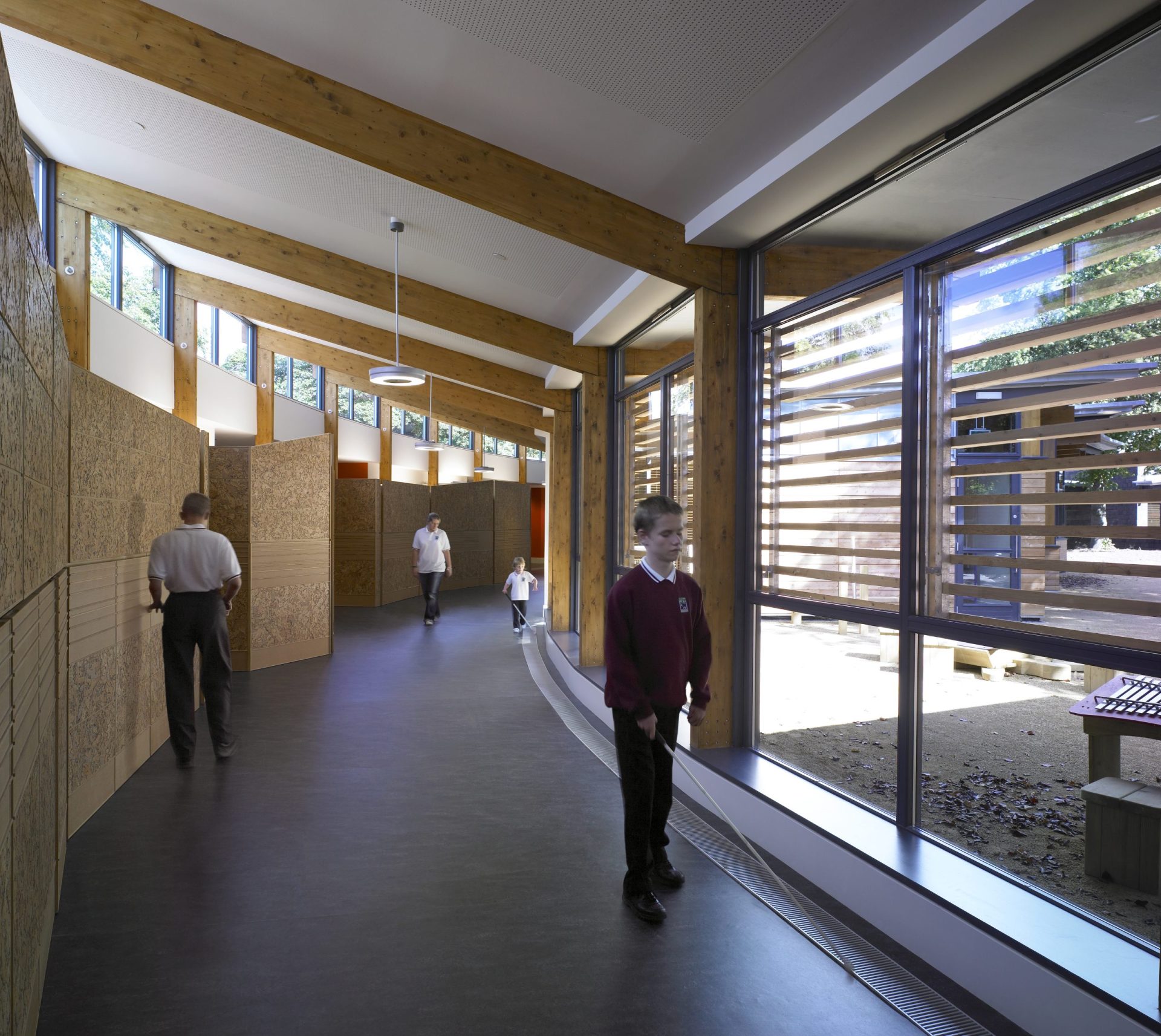
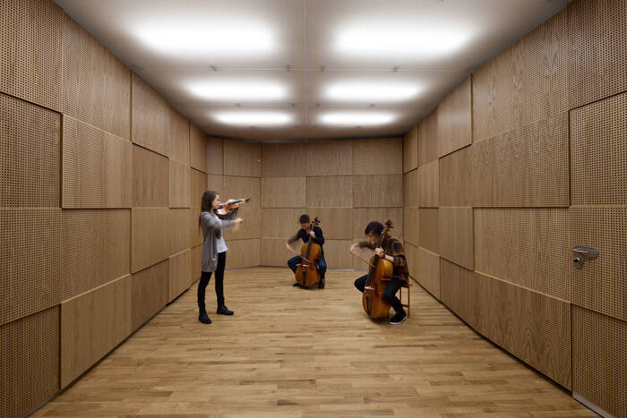
When it comes to tactile aspects, sensory seekers prefer tactile surfaces that have rougher textures and materials. They are looking for those textures that can provide an interactive experience. Tactile surfaces can not only be used for interaction but can also aid in wayfinding. A couple of examples of this are the Hazelwood School & Pattaya Redemptorist School. They can also be used for the purpose of helping with acoustical environment just like how they did at Sonorous Museum.

Intern Research Sensory Design Intern Research Sensory Design Intern Research Sensory Design

Pattaya Redemptorist School

Focusing on pre-braille curriculum, students with visual impairments can interact with multiple tactile surfaces that provide learning experiences and aid in wayfinding.

Pattaya School image from https://de51gn.com/creative-crews-discusses-its-award-winning-classroom-makeover-for-blind-children-in-thailand/


Hazelwood School

Hazelwood School included a braille tactile texture along their corridors to help aid in wayfinding for students with visual impairments.

Hazelwood School image from https://architizer.com/projects/hazelwood-school/


Sonorous Museum – Studio Spaces

Sonorous Museum used tactile textures to help create optimal acoustic environments specific instruments in four different studio spaces.

Sonorous Museum image from https://www.adept.dk/project/sonorous-museum

Intern Research Sensory Design Intern Research Sensory Design Intern Research Sensory Design

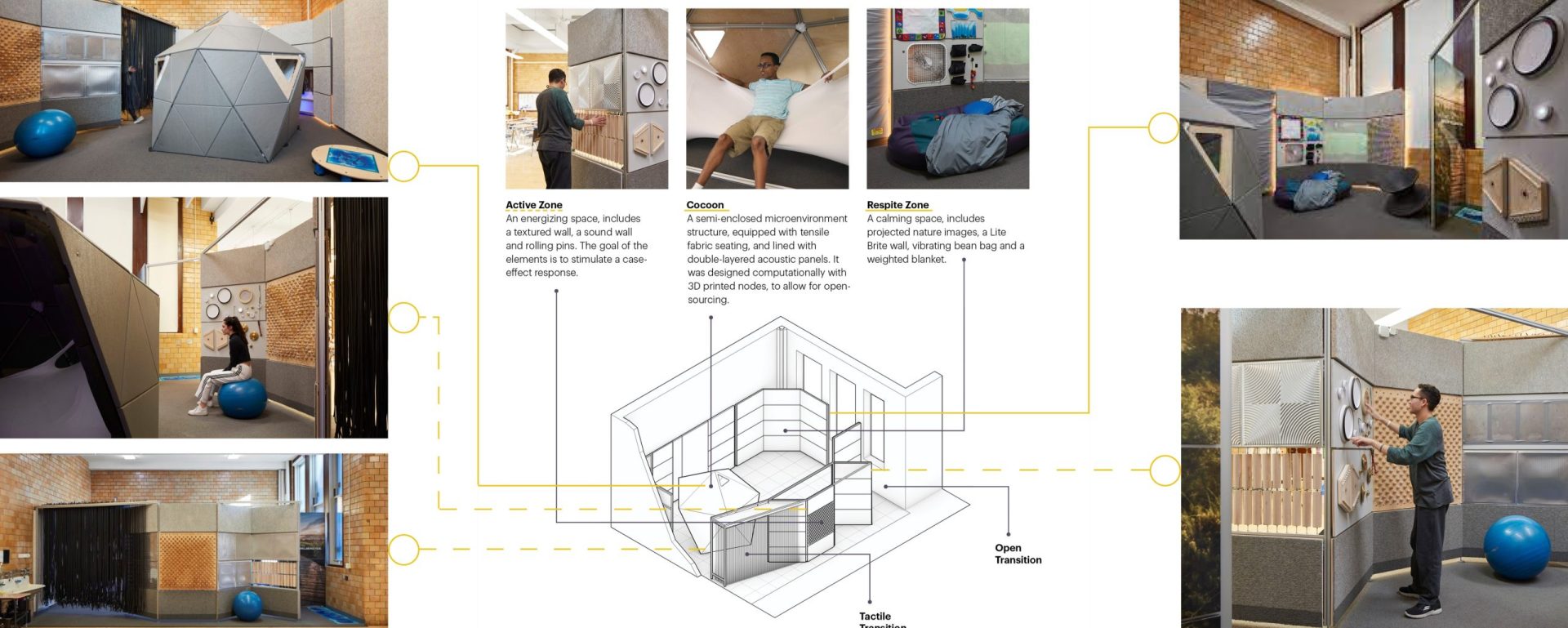
Compared to sensory seekers, sensory avoiders gravitate towards the softer textures and materials that provide a sense of comfort. They are drawn to the textures and materials that give them the idea of seclusion and an area that they can retreat to. Alcoves that have tactile experiences are a great way of accomplishing this. One notable example of balancing the two different tactile preferences is the Lanetech Well-being Hub. HKS created a sensory well-being hub at Lanetech High School. This sensory well-being hub had three sensory zones.

Images below from https://www.hksinc.com/our-news/articles/the-sensory-wellbeing-hub-at-chicagos-lane-tech-college-prep-high-school/; https://www.hksinc.com/how-we-think/research/sensory-well-being-for-adolescents-with-developmental-disabilities-creating-and-testing-a-sensory-well-being-hub/; diagramming done by Lauren Mullins.

Intern Research Sensory Design

Visual aspects in sensory design include both color and lighting. When it comes to color, sensory seekers are drawn to the bright warm colors that are stimulation while sensory avoiders are drawn to the cooler colors that are more peaceful.

sensory design color diagram

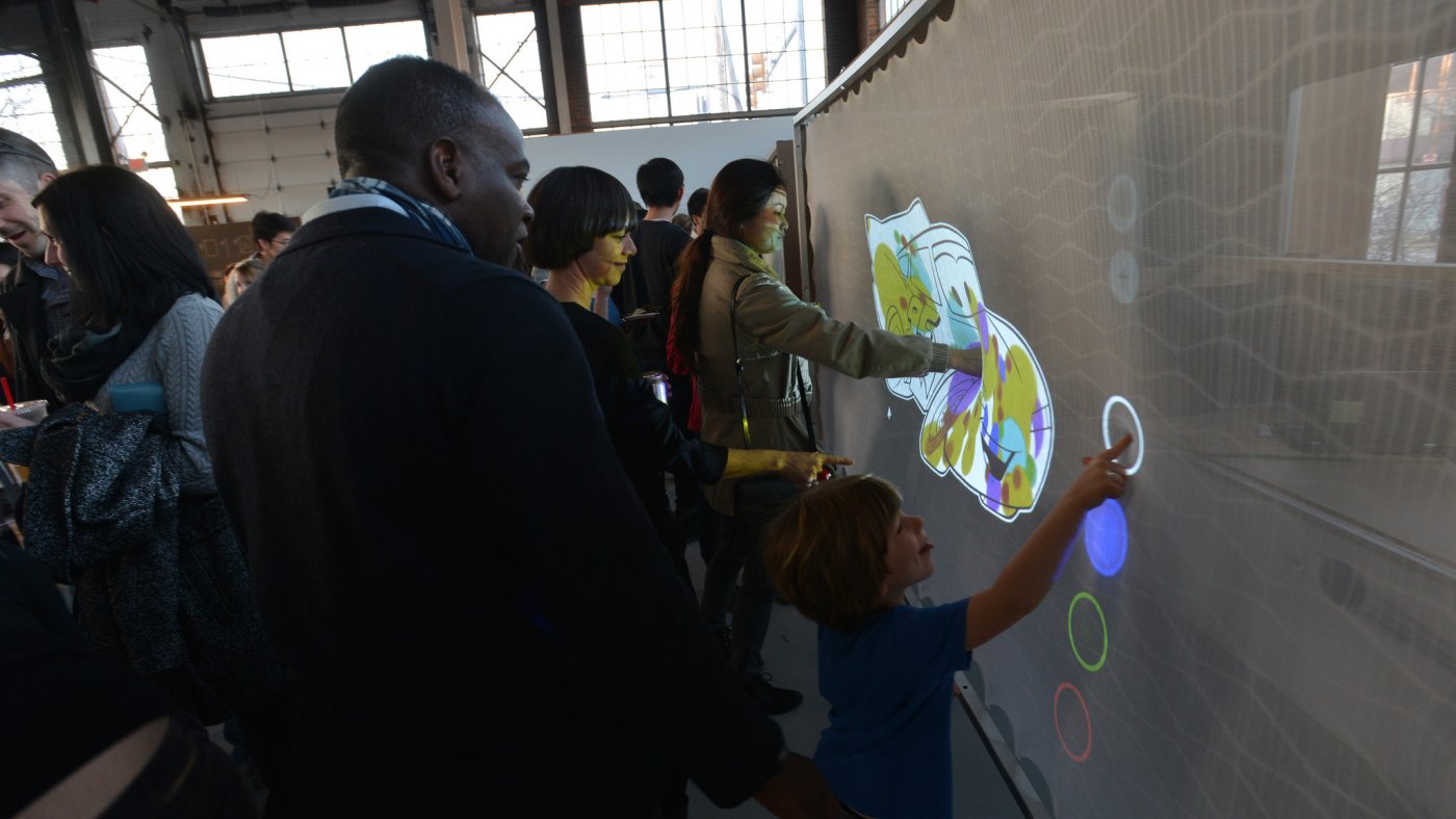
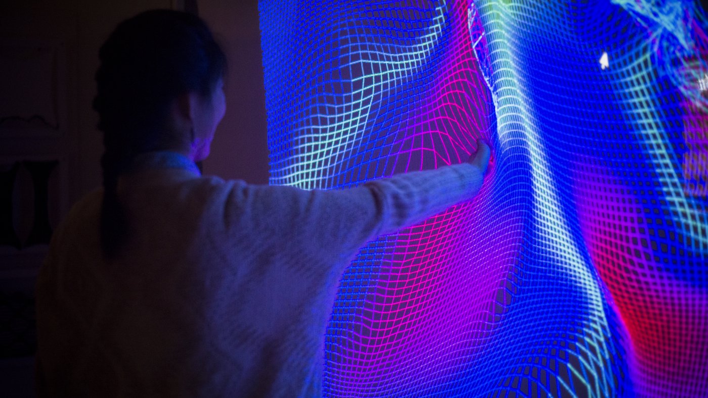
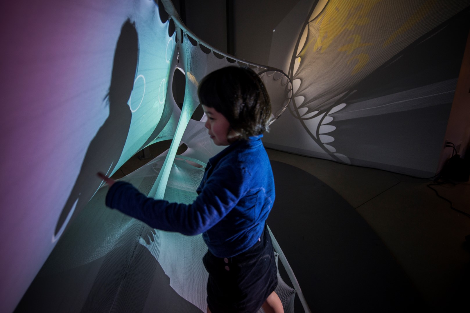
As far as lighting, sensory seekers are looking for those stimulating lighting experiences. An example of the lighting experiences that sensory seekers are drawn towards is the research project Social Sensory Surfaces. This research project was overseen by University of Michigan professor, Sean Ahlquist. The idea was to develop new technologies designed to confront learning and social challenges for children with autism. There are three smaller projects a part of this research that all deal with exploration of color and lighting in unique ways.

Project 1 – Stretch Color

A visual correspondence to a specific application of pressure.


Project 2 – Stretch Warp

Engages more full body movement as a part of the visual feedback.


Project 3 – Stretch Color

A large – scale textile environment with tactile, visual, and auditory feedback.

Images from https://taubmancollege.umich.edu/research/research-through-making/2015/social-sensory-surfaces.

Intern Research Sensory Design Intern Research Sensory Design Intern Research Sensory Design

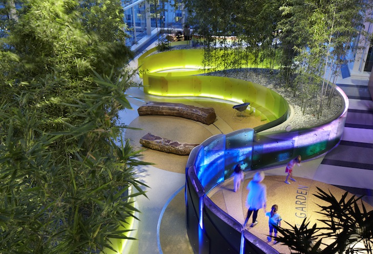
Sensory avoiders on the other hand, prefer a calm dimmer lighting environment. An example of a project that was able to provide lighting opportunities for both sensory types is the “Light Wall” Installation at Lurie Children’s Hospital. A part of the Crown Sky Garden, this installation provides both calming and vibrant lighting animations depending on if the wall is being interacted with or not.

“Light Wall” Installation – sensory seeker visual experience with vibrant color animations when installation is interacted with and sensory avoider experience with calmer color animations when not being interacted with.

Image from https://www.asla.org/2013awards/374.html

Intern Research Sensory Design

Auditory aspects can have a significant impact on how people experience a space. For sensory seekers, they thrive off loud stimulating sounds that can be interactive, while sensory avoiders would rather have quiet calming sounds or have sound blocked out. An example of a study that was able to appeal to both sensory types is the RESET Stress Free Zone. This project, done by UNStudio, created a series of pods that all had various stress-free zones for office workers. The idea was to appeal to the different versions of what someone would consider a stress-free zone. Some pods provided a space for sensory seeker auditory experiences while others provided a space for sensory avoider auditory experiences.

RESET Stress Free Zone – sensory seeker auditory experience


RESET Stress Free Zone – sensory avoider auditory experience

Images from https://www.architonic.com/en/project/unstudio-reset-stress-free-zone/5104977

Intern Research Sensory Design Intern Research Sensory Design

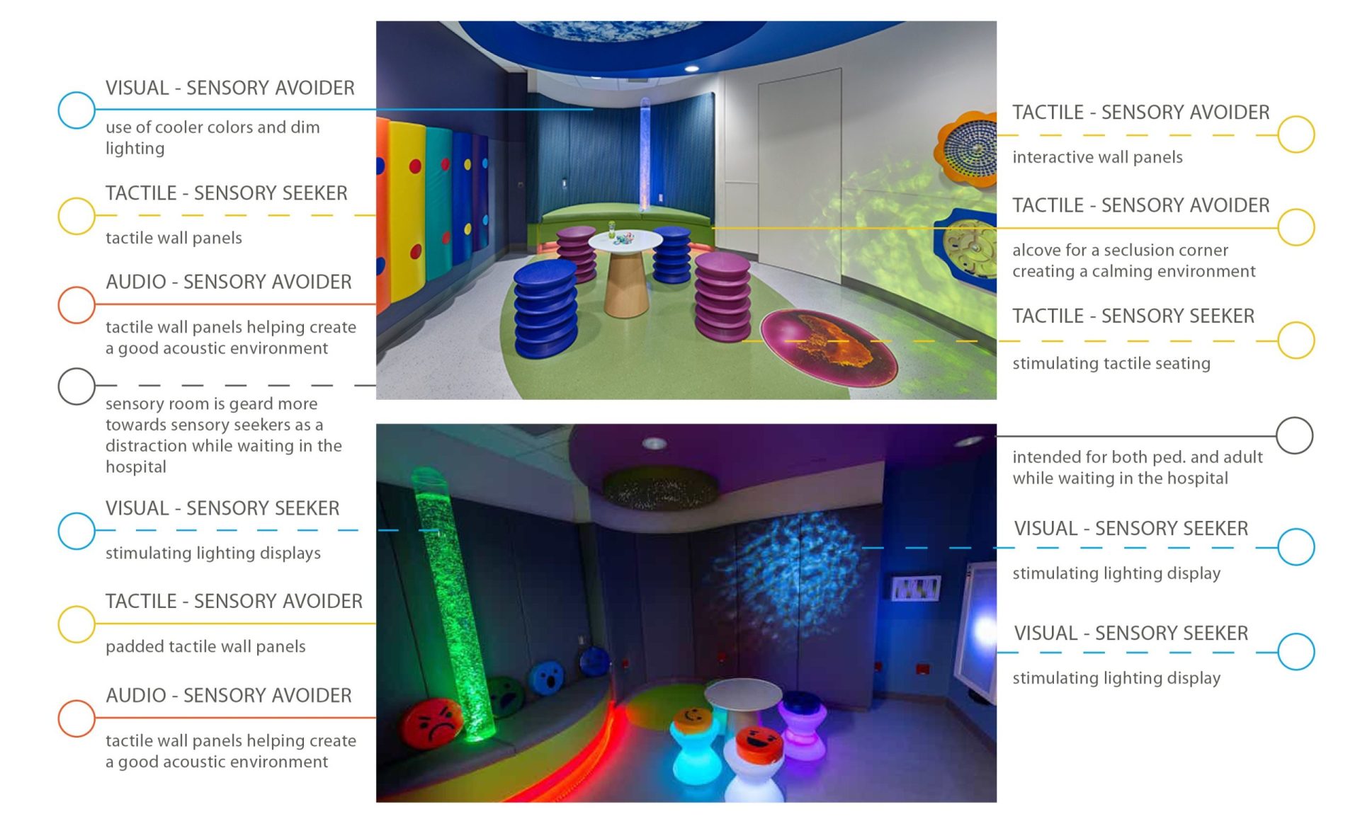
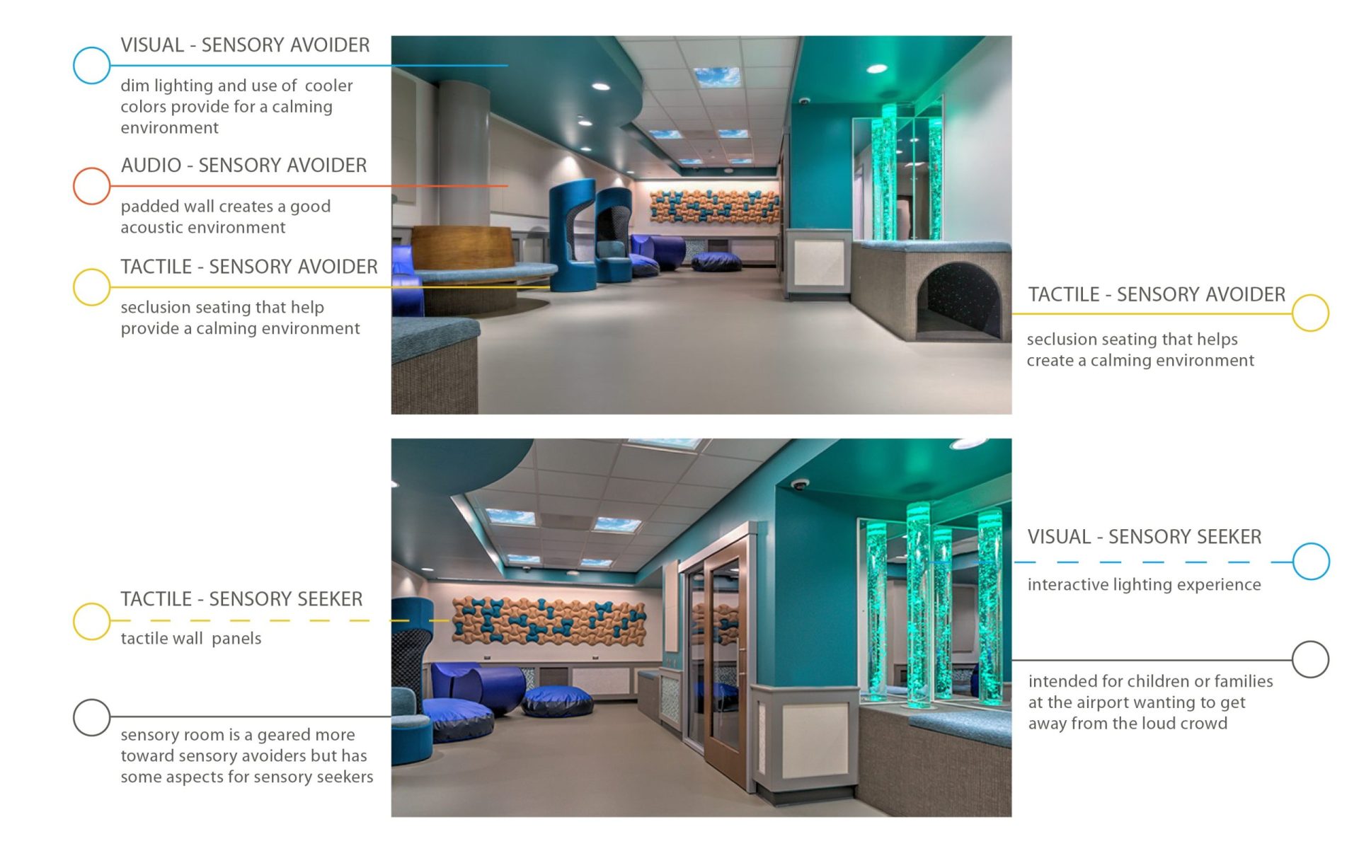
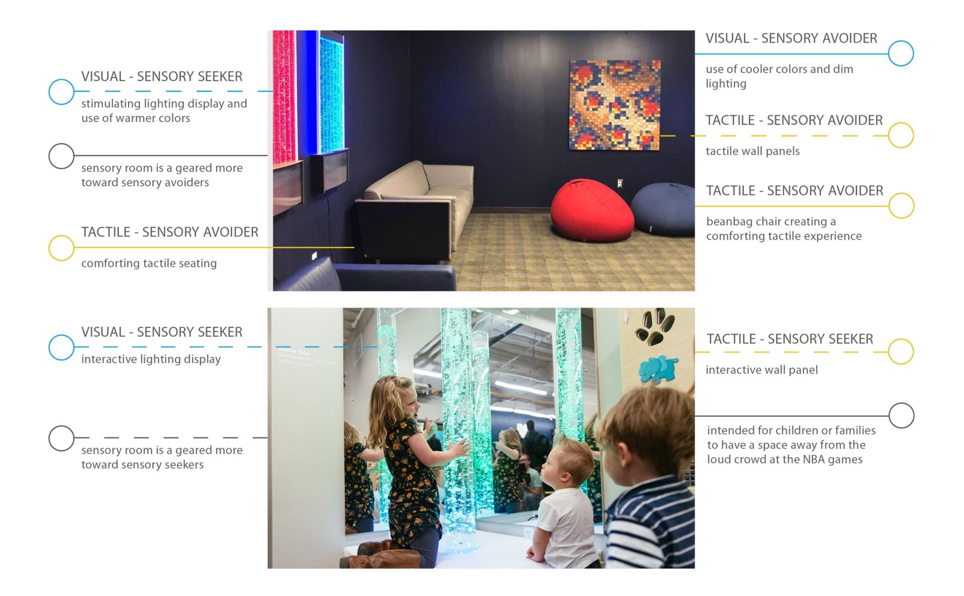
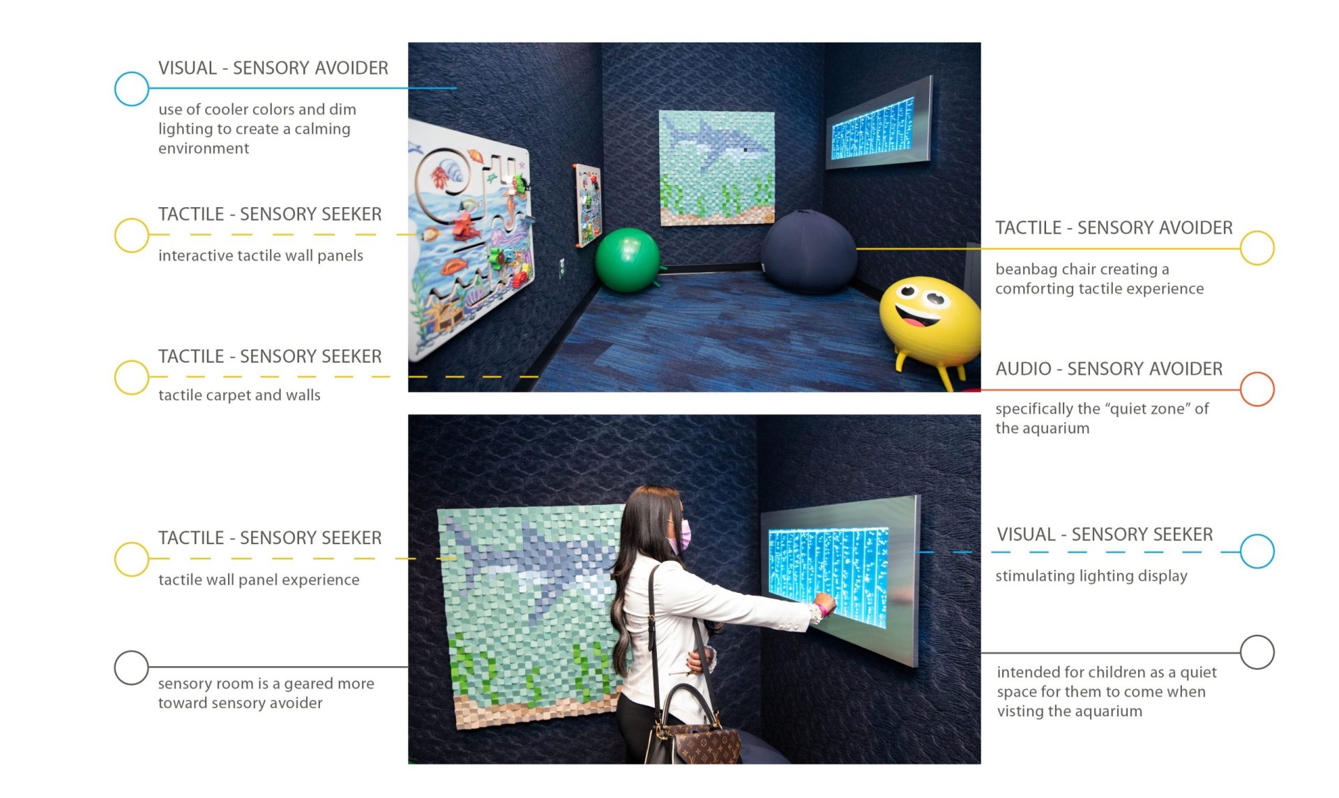
One way that sensory design has been used is through sensory rooms. A sensory room is a dedicated space for providing sensory stimulation in a controlled environment. One aspect of sensory rooms that is great is that they can be applied to a variety of program types. Some sensory rooms can be geared towards sensory seekers but have a few opportunities for sensory avoiders. One example of this type of sensory rooms are the sensory rooms in the pediatric emergency department at Robert Johnson University Hospital. Other sensory rooms are geared more towards sensory avoiders with the idea of a quiet space away from the large crowds. A few examples of these sensory rooms are at the Pittsburgh International Airport, NBA Arenas, and at Georgia Aquarium. Being able to be applied to many different program types shows just how simple it can be to apply basic sensory design concepts into a space. It is a concept that isn’t typically thought about but can make a huge difference in how people experience a space.

Robert Johnson University Hospital – Multi-Sensory Room Diagram

Images from https://www.dccdesigngroup.com/press-story-autism-friendly-emergency-room/ ; diagramming by Lauren Mullins


Pittsburgh International Airport – Sensory Room Diagram

Images from https://www.hayesdesign.com/new-sensory-friendly-room-designed-by-hdg/ ; diagramming by Lauren Mullins


NBA Arenas – Sensory Room Diagram

Images from https://www.nba.com/jazz/sensory-room; diagramming by Lauren Mullins


Georgia Aquarium – Sensory Room Diagram

Images from https://news.georgiaaquarium.org/stories/releases-20201216 ; diagramming by Lauren Mullins

Intern Research Sensory Design Intern Research Sensory Design Intern Research Sensory Design Intern Research Sensory Design
Copyright ©2024 Design Collaborative