In the article, she discusses offering flexibility, healthy and sustainable options, access to nature, and spaces to relax and have fun. Now that we have the physical spaces and policies needed for a destination office understood, we will look at how adding a layer of environmental graphics can reinforce your culture, brand, and inject personality into a workplace. Let’s take a quick tour of our own headquarters and what we strive to display about DC to the staff, clients, and guests visiting the space.
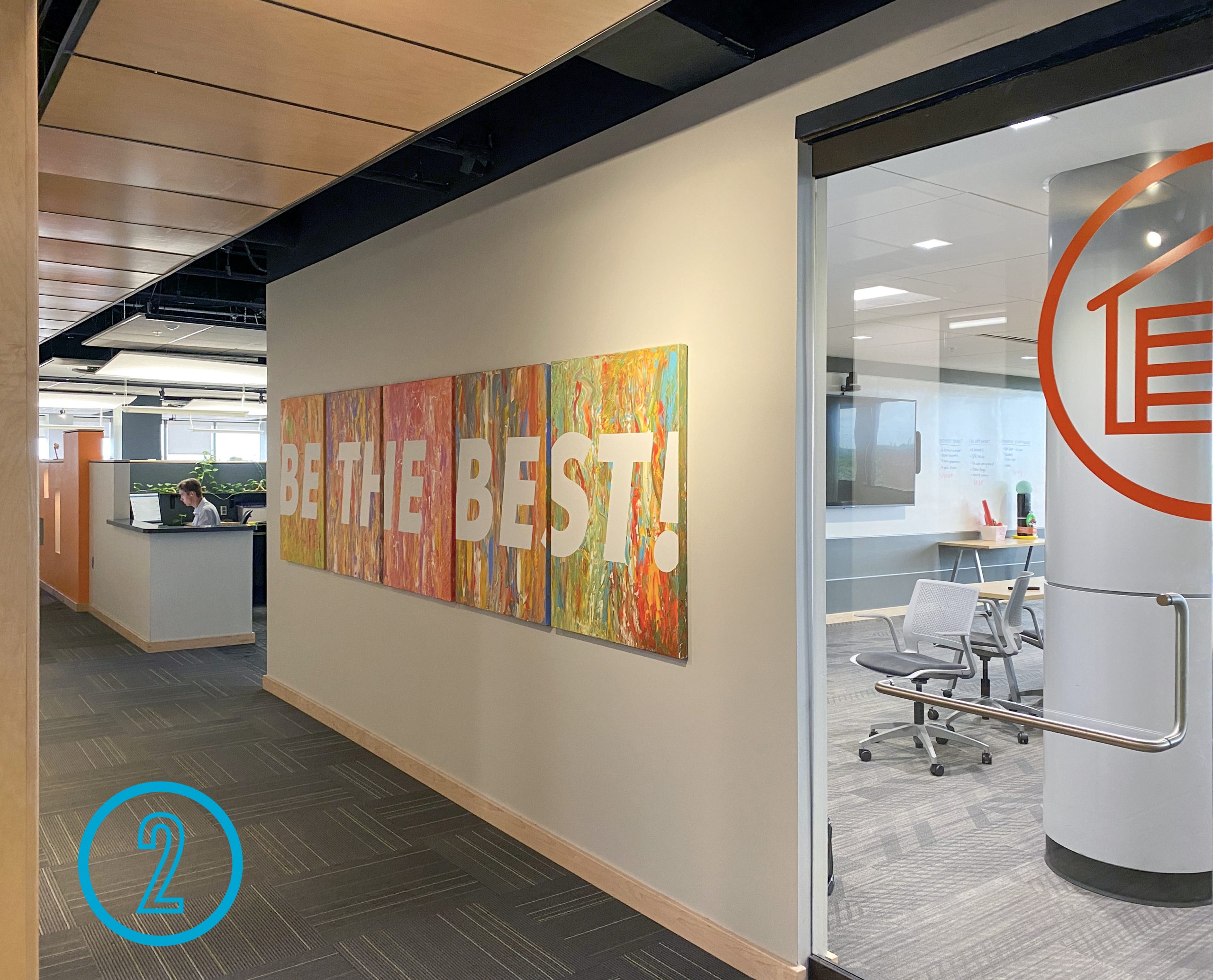
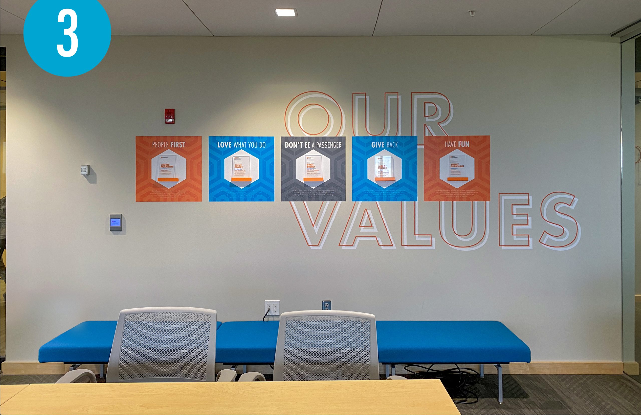
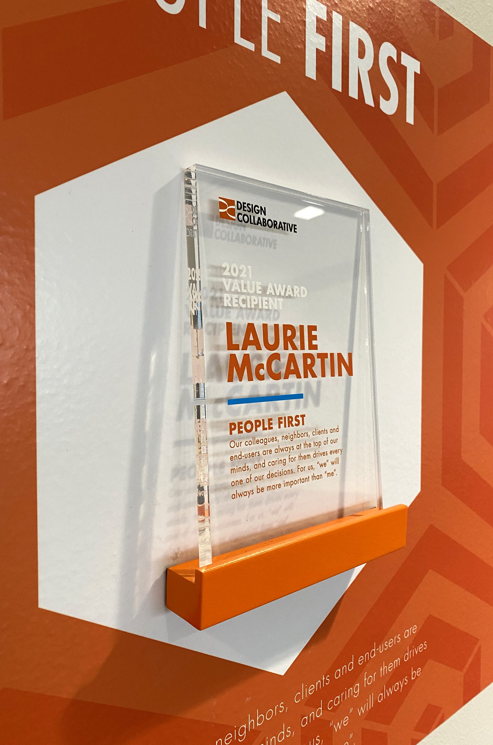
1. The elevator lobby is the first thing you see of the DC office when you step off of the elevator. Typically in a building like ours, the elevator lobby is the shared space of multiple tenants. Guests have a moment to confirm they are on the right floor and then navigate to their destination’s main entrance door. DC now occupies the entire floor, so once the doors open you are in a main circulation space and a part of the shuffle. Watch out for scooters or Nathan (architect) making a beline for a free cookie up front – it might be surprising to be in the DC hubub already. The oversized floor number graphic quickly establishes you are in the right spot, then lets you focus on our logo and reception wayfinding to get folks moving the in right direction. The look and feel of the elevator lobby start to set expectations for what we want staff, clients, and guests to experience when interacting with DC. Modern, clean and organized, but a little bold and fun too. 2. After being greeted by Laurie at the front desk, you might notice our custom artwork adorning our largest conference room. This was created by our staff at our 2018 Bonanza, an event where the whole office gets together to problem solve and dream big for the next year ahead. The office was divided into group and given a canvas with carefully selected on-brand paint colors and invited to create a masterpiece together. Vinyl decals were later pulled off and the theme for the next year was revealed! This now serves as a reminder that we strive to have the best drawings and customer service alongside our creative designs. Plus it was fun. 3. A company’s purpose and core beliefs are spelled out in a mission statement and values, but are often tucked away and not remembered. At DC, we feel strongly that if you embody our values, you will be successful here. We display our values in our main conference room, the Garage (read #5 if you think that’s weird), the room we start in each week gathered together for staff meetings. To further instill the importance of our values, the staff nominates each other for outstanding displays of these values with annual winners displayed in the Garage. |
|
|
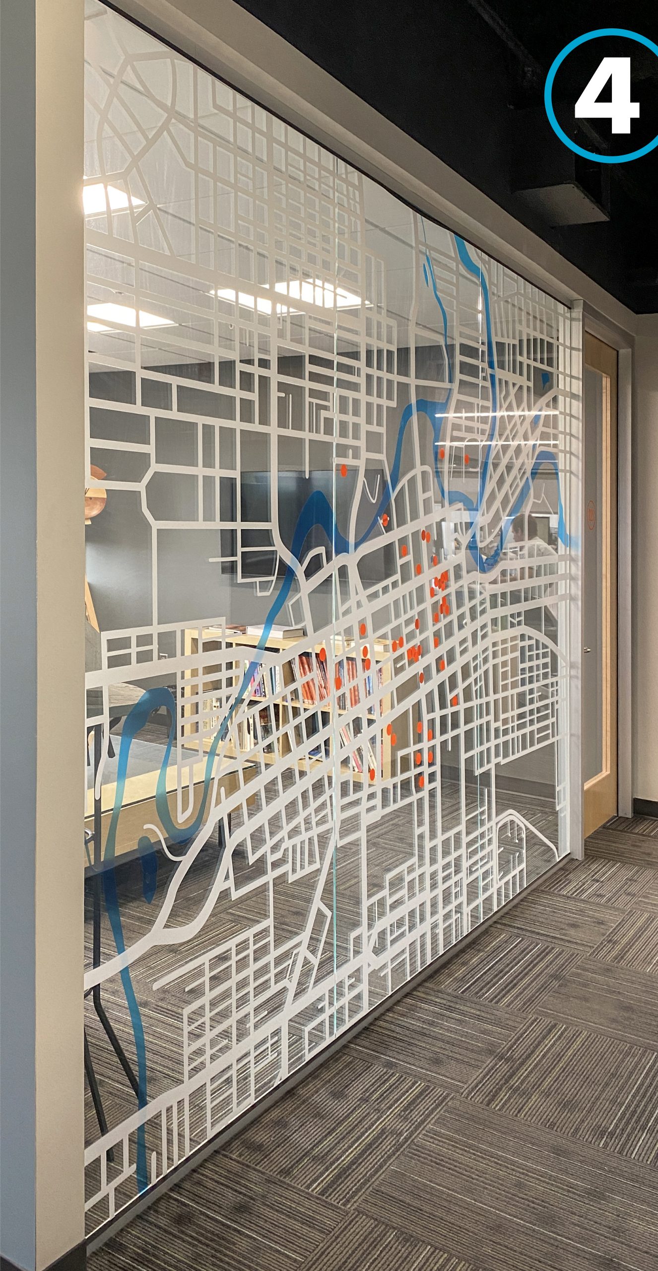
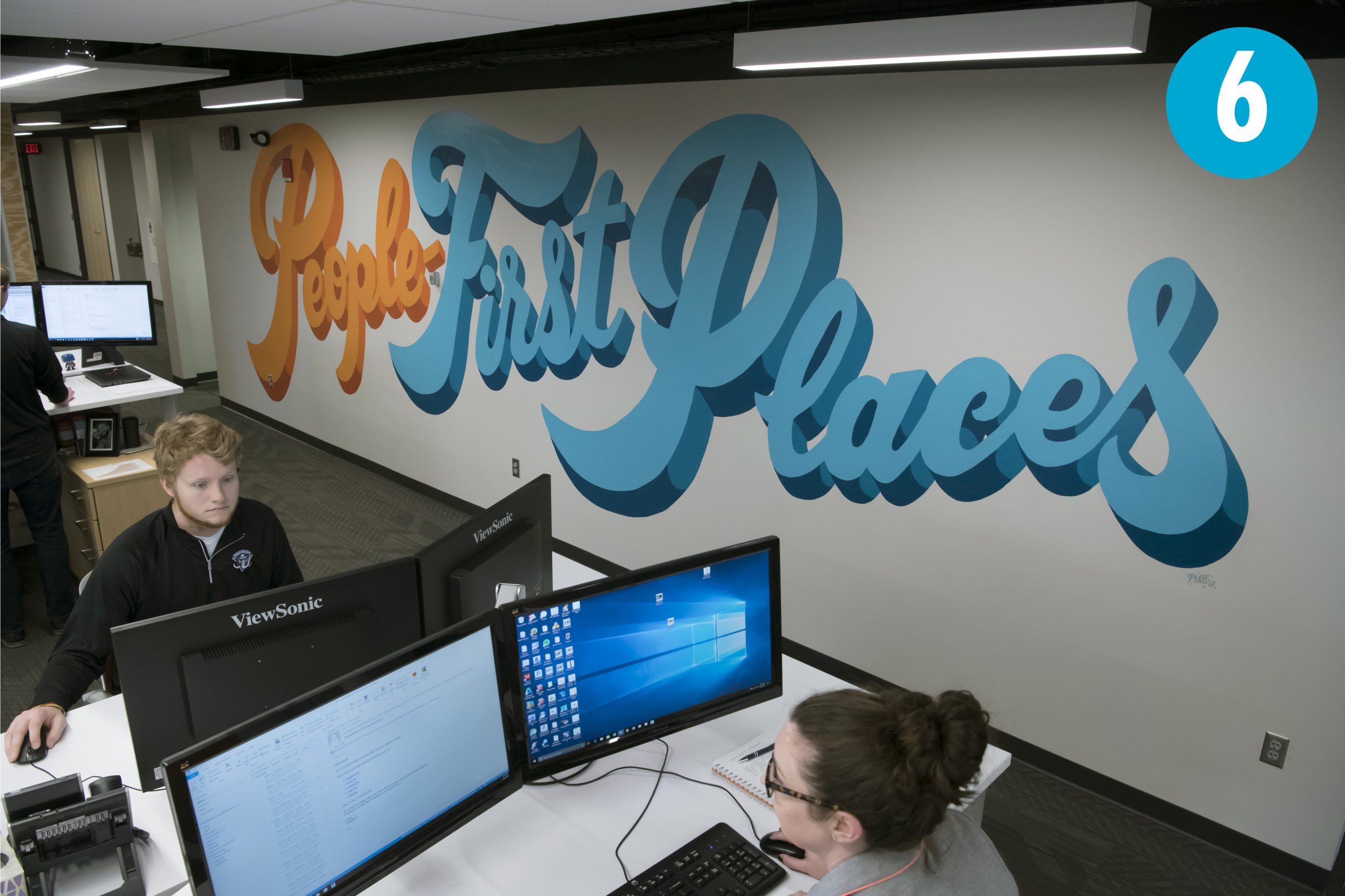
4. We love being a part of our community, whether it’s taking part in the festivals, living and working downtown, or designing and creating new spaces for the city. To celebrate our hometown and the projects we have completed in it, a vinyl film map adorns a meeting room. The roads are applied to the hallway-side of the glass so that the blue film representing Fort Wayne’s three rivers can flow uninterupted on the meeting room side of the glass and create a little bit of depth. Orange dots mark DC projects and continue to be added. 5. Conference room names are an opporunity to tell a story. Room 211 is unremarkable, but having a meeting in the Kugaruga (go-cart icon) or the Garage (image #2) makes guests want to know more. Each conference room icon is displayed on the exterior as wayfinding with an accompanying monitor background image that tells a short story of the “why” behind the name and icon. Hearing Pat’s high-school story about a kid named Kugaruga and getting the go-cart on the road is great icebreaker for new faces and gives a peek into our work ethic. 6. Our motto is People-first places. It influences how we interact with clients, how we design spaces, and how DC supports its staff. Displaying the saying became an obvious opportunity to add some interest to an open office area. As a surprise Christmas gift for our Partners, we hired local artist Matt Plett to hide in a tent made of tarps and paint this fun mural. He worked with us to incorporate brand colors while injecting his own style to bring a new look to the space. |
Including environmental graphics in a workplace is more than just a logo on the desk and painting an accent wall with a brand color. Intentional graphics create an opportunity to tell a story and connect staff to company culture. They can provide a little context for potential employees touring your space or new clients wondering why you’re different than the competition. Think about what makes your workplace a destination and celebrate it through intentional environmental graphics.
Katie listens to clients to learn their goals and understand their brand. Working alongside architects, interior designers, and engineers, she then translates this knowledge into unique branded environmental graphics and signage to convey the spirit of a client’s culture into their project. She believes that putting yourself in the shoes of the end-user illuminates the…