Search this Site

Close

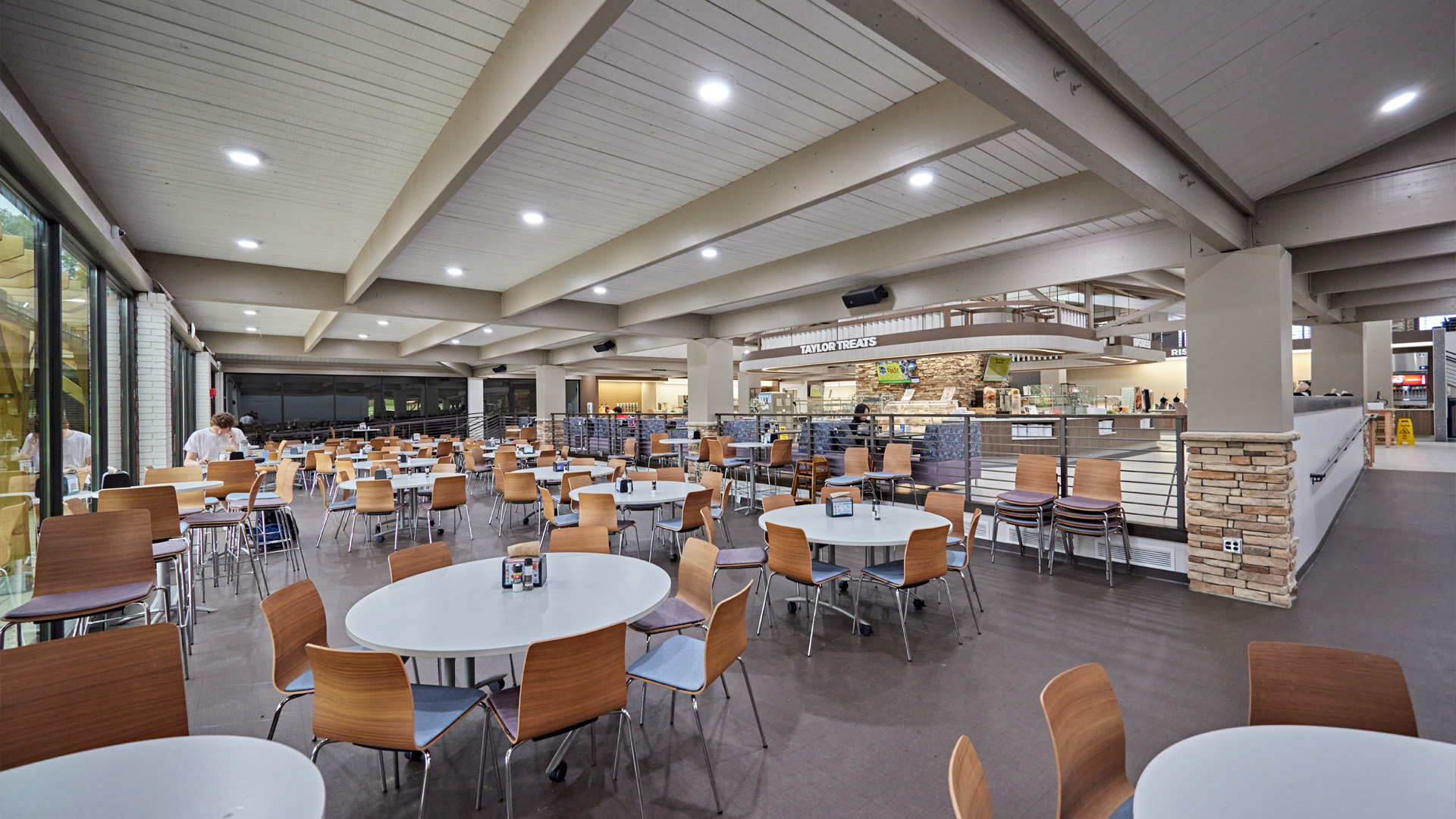
In education design, we spend a lot of time wrestling with complex problems—enrollment uncertainty, aging facilities, tight budgets, mental health, student belonging, academic performance. These challenges are real, interconnected, and rarely solved with a single move.

But here’s the truth we see again and again:
not every solution to a complex problem has to be equally complex.

Sometimes meaningful change comes from simple, intentional decisions—ones that are affordable, scalable, and surprisingly powerful. One of the most overlooked? Color.

A thoughtful color strategy can influence how students feel, how long they focus, how they collaborate, and how they move through space. It’s not flashy. It doesn’t require a ribbon cutting. But the impact is real—and well supported by research.

Collaborative space with bold colors with Wayne high school library. Taylor University Hodson Dining room

How Color Influences Learning

Every space teaches something.

Before a student reads a syllabus or meets a professor, the environment is already sending signals—this is a place to focus, this is a place to collaborate, this is a place to pause and breathe.

Color plays a central role in that conversation.

Far from being decorative, color shapes how the brain responds to space. It influences energy levels, attention span, and social interaction. When applied strategically, it can help learning environments work with students rather than against them.

Drawing on research, we explore how different color palettes influence learning and how those insights inform our approach to designing academic environments.

Cool Colors (Blues, Soft Greens, Teals)

Best for: Focused, solitary, or cognitively demanding work

Cool colors reduce sympathetic nervous system activity (our “fight or flight” response) and calm the body. Research shows blue supports accuracy and sustained attention, while green improves reading comprehension and reduces eye strain. Students working in cooler-toned environments stay “in the zone” longer, and the spaces feel quieter—people naturally lower their voices.

Where to use them:

  • Study rooms
  • Testing areas
  • Tutoring spaces
  • Heads-down nooks and carrels

How to apply them:

Think matte textures, soft upholstery, acoustic felt, cool-toned carpet fields, and light washes—far more effective than bold painted walls.

Trine University eSports Arena Trine University Thunder Ice Arena Suite

Warm Colors (Reds, Corals, Yellows, Oranges)

Best for: Collaboration, energy, and social connection

Warm colors increase physiological arousal: heart rate ticks up, students speak more freely, and group work becomes more animated. Red tones stimulate emotional engagement, while yellow and orange enhance optimism and creative thinking.

Warm palettes also encourage what group-dynamics researchers call “social risk-taking”—students are more willing to share ideas in a warm environment.

Where to use them:

  • Collaboration zones
  • Project rooms
  • Breakout spaces
  • Student commons
  • Maker labs

How to apply them:

A little goes a long way. Strategic accents, warm wood slats, and upholstery choices create energy without overwhelming the space.

Purples & Magentas

Best for: Creative studios, arts spaces, reflection areas

Linked to imagination and divergent thinking, purple can help a space feel exploratory and less literal. Strong hues are powerful—use them intentionally and sparingly.

Where to use them

  • Art and design studios
  • Music and performance spaces
  • Innovation labs
  • Reflection or contemplation areas

How to apply them

Accent walls, specialty finishes, or layered textiles allow these colors to make an impact without dominating the space.

Black box theatre with seating.

Neutrals as Balancers

Neutrals are the “quiet voice” that let color do its job. They elevate natural daylight, help the brain rest between color zones, and keep warm hues grounded. Wood tones (oak, birch, cork) layer in warmth without creating visual noise.

Use neutrals to:

  • Ground a palette (charcoal, taupe)
  • Support daylight (soft whites)
  • Add warmth (natural wood)
  • Regulate transitions between high-energy and low-energy spaces

Color as Behavioral Wayfinding

One of the most powerful applications of color in education design is its ability to signal the purpose of a space without relying on words or signage.

It’s not about telling students what to do—it’s about designing a space that makes the right behavior feel natural.

Example behavior-coded zones:

  • Focus zones: blues, greens, cool textures
  • Collaboration zones: coral, orange, warm wood
  • Maker/innovation zones: energetic yellows, durable warm materials
  • Social commons: warm neutrals with subtle, friendly pops of color
  • Spiritual or reflection spaces: desaturated greens, soft purples, linen-toned neutrals

This approach can be embedded in materials, lighting, textures, and finishes—not just paint.

University of Notre Dame Nieuwland Hall of Science Study Booths with blue accents. Mercy Health St. Rita's Graduate Medical Education Clinic classroom Trine College of Health Professions - Stairs

Add Biophilia for Even Stronger Impact

Color becomes even more effective when paired with natural textures and patterns. Wood, plants, daylight, and organic forms reduce stress and increase student comfort. Spaces feel warmer, calmer, and more human—which improves both learning and retention.


Why This Matters for Schools and Universities

Students today need spaces that support well-being, academic success, and a sense of belonging. Thoughtful color strategy is one of the most cost-effective ways to enhance learning outcomes—especially in existing buildings where major renovations may not be feasible.

Color can help your campus:

  • Improve focus and reduce distraction
  • Increase collaboration and creativity
  • Reduce stress in high-pressure environments
  • Strengthen wayfinding and space legibility
  • Shape student behavior without adding staff or signage

Good design doesn’t have to be expensive. Sometimes it starts with the smallest, smartest interventions.

Purdue University Robert E. Heine Pharmacy Building Under Stairs

If you’re updating classrooms, study spaces, or student commons—and want to make sure every dollar works harder for your students—color and material strategy should be part of the conversation.

And if your goal is to create learning environments that don’t just look good, but actively support focus, well-being, and academic success, reach out to our team of architect, interior designers and engineers who would love to help you explore what’s possible.

Copyright ©2026 Design Collaborative